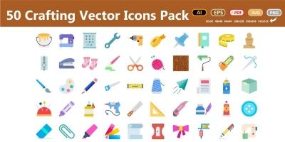
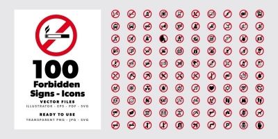
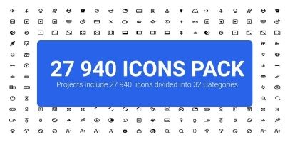
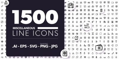
 Icons
Icons

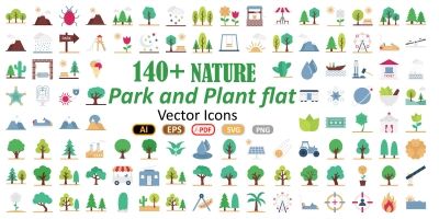

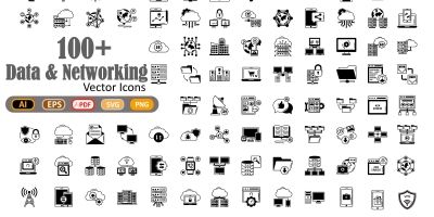
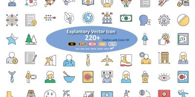
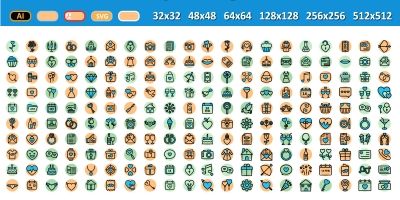

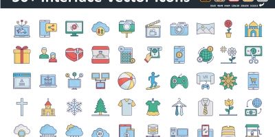
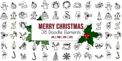
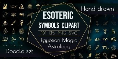
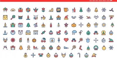


More about Icons
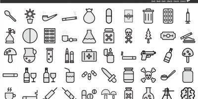
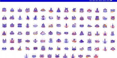
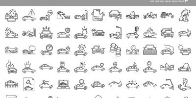
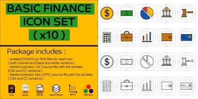
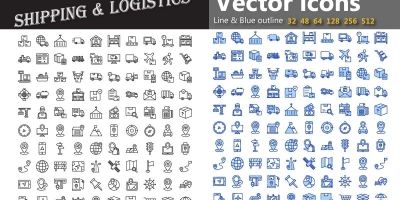
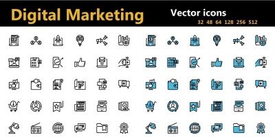
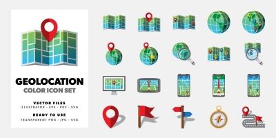
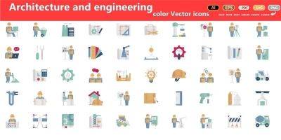
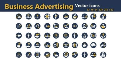
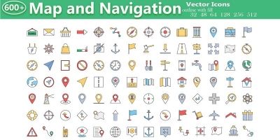
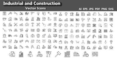
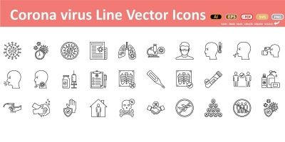
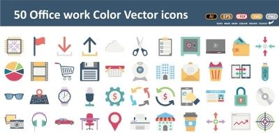
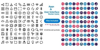
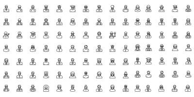
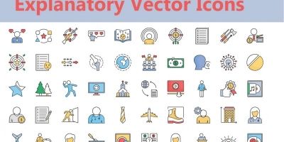
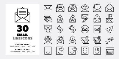
If you’re putting together websites or polishing a mobile apps, the right icon packs makes the whole project feel more intentional. This collection brings together SVG icons, PNG icons, and icon pack that you can drop into your workflow and customize without drama. Expect practical files in SVG and PNG, plus previews that make it easy to compare styles. Whether you’re building for clients or shipping your own product, you’ll find options that look modern, stay consistent, and save you time.
Looking for a broader set? Start at Graphics, or jump to User Interfaces, Icons, and Logo Templates for a full visual system.
Inside this collection
- SVG icons and PNG icons designed to stay readable at real-world sizes.
- Files in SVG / PNG so you can tweak colors, layers, and typography.
- Styles that work for websites and mobile apps — from clean and minimal to bold and playful.
- Assets that pair well with related categories like Icons and Logo Templates.
- Useful variations such as line icons and flat icons for common project needs.
- Community-made downloads that are easy to compare using sorting and filters on the page.
Typical use cases
Creators use icon packs for everything from quick prototypes to polished releases. These are especially useful for:
- websites
- mobile apps
- dashboards
- presentations
- UX prototypes
Working with the files
Most downloads are delivered in familiar formats such as SVG, PNG, EPS and AI. That means you can edit in your preferred tools and export exactly what your project needs. For icons, vectors are ideal when you need crisp scaling; keep a consistent viewBox and export a small size set for developers.
A quick selection checklist
A small checklist goes a long way: does it scale well, does it read at small sizes, and is it easy to tweak? For templates, pay attention to grids and typography hierarchy. For graphical assets, check if layers are named and grouped logically. And if you’re buying for a team, pick a style that can carry through future pages and screens without looking out of place.
A quick quality check
This stuff is easy to skip when you’re in a hurry, but it pays off. A two‑minute check now can save an afternoon of fixes later.
- Open the source file once before you commit — it’s the fastest way to spot messy layers or missing assets.
- Check for consistency: spacing, alignment, and style details should match across the pack.
- Make sure text is editable (or easy to replace) and key elements are grouped logically.
- Verify stroke weight and corner radii; small differences are obvious once icons sit next to each other.
- Export a few common sizes (16/24/32/48) to confirm legibility.
Make it easy to reuse
To keep things tidy, create a small “assets” folder per project (and keep the original download untouched). Make edits in the source format, then export only what you need for the build. If you’re working with vectors, export to SVG for crisp scaling; for raster assets, keep an eye on pixel density and compression. A quick naming convention (like `ui/button_primary` or `icons/outline/settings`) also makes future you very happy.
Practical tip: If you’re mixing icons from different packs, standardize the stroke width and optical size first. It’s a small change, but it makes a set feel intentionally designed instead of patched together.
Quick FAQ
- SVG vs PNG — which is better? SVG scales cleanly for UI; PNG is handy for fixed-size exports and older workflows.
- How many icons do I need? Start with essentials (navigation, actions, status), then expand as features grow.
- Can I mix packs? You can, but standardize stroke width and corner radius so they feel like one set.
Explore more on Codester
- User interface kits
- Logo templates
- Print templates
- Textures & patterns
- App templates
- Graphics marketplace
Learn more
Want to dig deeper or align with common conventions? These references are handy while you customize:
Take a look at what’s available, choose a style that fits, and download what you need. When you keep your graphics consistent across UI, branding, and marketing materials, everything feels more polished — even before you add custom touches. Use the related category links below to build a complete set for your next release.