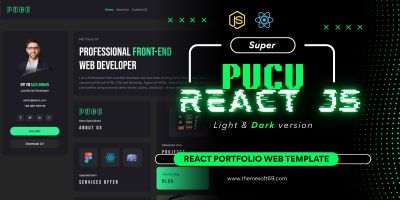
NextGen UI Kit - Modern React ComponentNextGen UI Kit - Modern React Component
Color‑rich React UI kit: 50+ glassmorphism components, light & dark themes, docs, playground & Figma assets for rapi
NextGen UI Kit - Modern React Component
Color‑rich React UI kit: 50+ glassmorphism components, light & dark themes, docs, playground ...
Screenshots


Overview
NextGen UI Kit is a production‑ready React component library that lets you build stunning, accessible, and fully responsive web apps in minutes. Version 2.0 ships 50+ pre‑styled elements—buttons, cards, navbars, sliders, tables, forms, modals, toasts and more—each built with modern CSS (glassmorphism, soft shadows, vibrant gradients) and tested in both light & dark modes.
A guided playground, robust documentation, and Figma design files accelerate workflow from design to code. Perfect for dashboards, SaaS products, portfolios, and admin panels.
Features
50+ hand‑crafted, themeable React components
Dual light / dark themes with instant toggle
Glassmorphism & soft‑shadow aesthetic
Fully responsive (mobile, tablet, desktop)
Accessible (WCAG 2.1 AA) & keyboard friendly
Playground + Storybook‑style docs
TypeScript definitions included
Tree‑shakable, zero‑dependency CSS‑in‑JS
Built‑in color system & CSS variables
Figma UI kit (included in main ZIP)
Requirements
Node.js ≥ 16 & npm / pnpm / yarn
React ≥ 18 (TypeScript or JavaScript)
Modern browser for development preview
Instructions
1. Unzip the main file.
2. npm i nextgen-ui-kit (or local yarn install).
<b><b>
jsx
CopyEdit


import { NextGenProvider } from 'nextgen-ui-kit';
root.render(<NextGenProvider><App /></NextGenProvider>);


</b></b>
Other items by this author
Future product updates
Quality checked by Codester
Lowest price guarantee
| Category | Themes / Miscellaneous |
| First release | 4 July 2025 |
| Last update | 4 July 2025 |
| Files included | .css, .html, Javascript .js |
| Tags | responsive, modern design, typescript, dark mode, next gen, accessibility, light mode, react ui kit, glassmorphism, component library, dashboard ui, figma assets, front‑end, web components, css in js |