Sodin - Minimal Gutenberg Blog ThemeSodin - Minimal Gutenberg Blog Theme
A clean, content-first WordPress block theme with fixed sidebar, AJAX comments, social sharing, and email subscription.
Screenshots
Overview
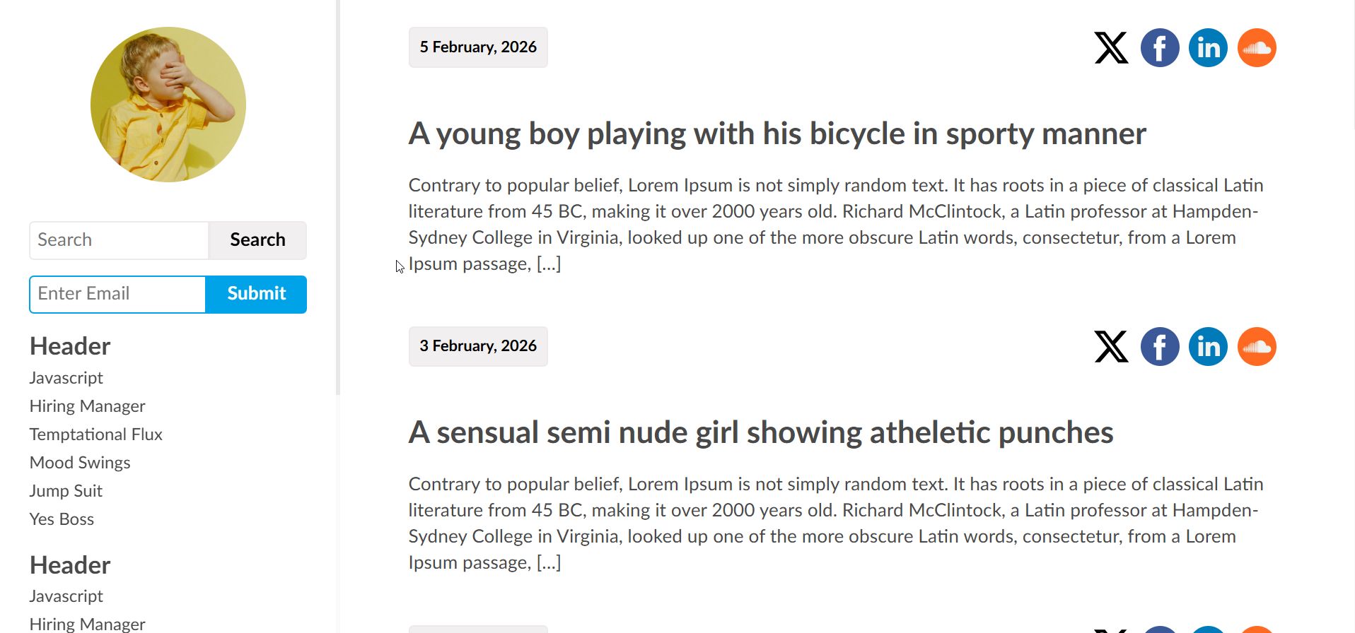
Sodin — A Minimal Blog Theme Built for Writers
Sodin is a content-first WordPress block theme designed for writers, thinkers, and daily bloggers who believe words should do the talking. Built entirely on the WordPress Site Editor (FSE), Sodin requires no page builder, no third-party framework, and no bloated plugin stack. You write, you publish, and the theme stays out of your way.
The layout follows a fixed left sidebar and scrollable content area architecture. The sidebar remains anchored as readers scroll through your articles, keeping your branding, search, subscription form, and navigation permanently accessible. On mobile, the sidebar collapses into a top bar with a smooth slide-in hamburger menu.
11 Custom Gutenberg Blocks
Every interactive element in Sodin is powered by a purpose-built Gutenberg block, registered through the WordPress Site Editor and rendered server-side for performance.
- Article Feed — Displays your posts with date, title, excerpt, and social sharing icons. Supports AJAX-powered "Load More" pagination that is context-aware across home, search, category, tag, author, and date archives.
- Post Comments — A complete AJAX commenting system with threaded replies, Gravatar avatars, honeypot anti-spam protection, and paginated comment loading in batches of 10.
- Social Sharing — Configurable social icons for 12 platforms including X, Facebook, Instagram, LinkedIn, Pinterest, Dribbble, Behance, Flickr, SoundCloud, Tumblr, DeviantArt, and VK. All icons are locally-hosted SVG files.
- Post Navigation — Back, Random, and Next post navigation buttons on single post pages.
- Post Tags — Renders post tags as pill-shaped linked buttons.
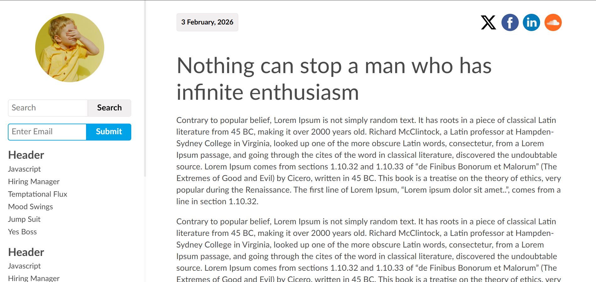
- Header Logo — Displays the site identity image in a circular avatar style.
- Search Form — Inline search input integrated into the sidebar.
- Subscribe Form — Email subscription input with submit button for building your mailing list.
- Sodin Menu — Sidebar navigation menus. Multiple instances can be placed for different menu groups.
- Hamburger — Mobile menu toggle that slides the sidebar content in from the left with a smooth CSS transition.
- Not Found — Custom 404 page block.
Typography and Design
Sodin uses the Lato font family, self-hosted in woff2 and woff formats across four weights (regular, regular italic, bold, bold italic). There is zero dependency on Google Fonts or any external CDN, which means faster load times and full GDPR compliance. All headings use font-weight 400 for a clean, understated look. The colour palette is deliberately restrained: dark grey for text, soft grey for backgrounds, and a single blue accent colour for interactive elements.
Technical Architecture
The entire stylesheet is built on CSS custom properties (design tokens) organised into a clear six-section architecture: Design Tokens, Reset and Base, Layout, Components, Utilities, and Responsive. The theme dequeues WordPress global-styles entirely to prevent inheritance conflicts, since it uses its own :root custom properties with zero references to --wp-- variables. This results in a self-contained, predictable styling system.
Responsive and Print Ready
Sodin provides three responsive breakpoints. On desktop, the sidebar is fixed at 250px with a maximum of 350px. Between 701px and 960px (tablet), the sidebar narrows to 200px. Below 700px (mobile), the sidebar converts to a collapsible top bar with hamburger navigation. A dedicated print stylesheet strips away the sidebar, social icons, navigation, and comment form for clean printed output.
Templates Included
Six page templates are included out of the box: Index, Homepage, Single Post, Archive, Search Results, and 404 Not Found. All templates follow a consistent structural pattern using WordPress template parts for the header, sidebar, and footer.
Requirements
- WordPress 6.4 or higher
- PHP 7.4 or higher
- No page builder required
- No third-party plugins required
Changelog
Version 1.0.0 — Initial release.
Features
- Full Site Editing (FSE) block theme — no page builder required
- Fixed left sidebar with persistent navigation
- 11 custom server-side rendered Gutenberg blocks
- AJAX-powered article feed with Load More pagination
- Context-aware queries for home, search, category, tag, author, and date archives
- AJAX comment submission with threaded replies and honeypot anti-spam
- Paginated comment loading in batches of 10
- Gravatar integration for comment avatars
- Social sharing icons for 12 platforms (X, Facebook, Instagram, LinkedIn, Pinterest, Dribbble, Behance, Flickr, SoundCloud, Tumblr, DeviantArt, VK)
- Locally-hosted SVG social icons — no external requests
- Email subscription form block
- Search form block
- Back / Random / Next post navigation
- Post tags displayed as pill-shaped linked buttons
- Circular avatar header logo block
- Multiple sidebar menu support
- Self-hosted Lato font family (woff2 and woff) — no Google Fonts dependency
- Four font weights: regular, regular italic, bold, bold italic
- CSS custom properties (design tokens) architecture
- WordPress global-styles dequeued for conflict-free styling
- Responsive at three breakpoints: desktop, tablet (701–960px), mobile (below 700px)
- Mobile hamburger menu with slide-in CSS transition
- Dedicated print stylesheet
- Six templates: Index, Homepage, Single Post, Archive, Search, 404
- Custom 404 page block
- WordPress 6.4+ compatible
- PHP 7.4+ compatible
- Clean, well-documented code with inline PHPDoc comments
- GPL-2.0-or-later licensed
Requirements
- WordPress 6.4 or higher
- PHP 7.4 or higher
- A web hosting environment with Apache or Nginx
- MySQL 5.7+ or MariaDB 10.3+
- No page builder plugin required
- No third-party plugins required
- A modern web browser (Chrome, Firefox, Safari, Edge) for the Site Editor
Instructions
Installation
- Log in to your WordPress admin dashboard.
- Navigate to Appearance > Themes.
- Click Add New Theme at the top of the page, then click Upload Theme.
- Click Choose File, select the sodin.zip file, and click Install Now.
- Once the installation completes, click Activate.
Setting Up Your Site Identity
- Navigate to Appearance > Editor to open the WordPress Site Editor.
- Click on the circular logo area in the sidebar to select the Header Logo block.
- Upload or select your site logo image from the Media Library. A square image works best as it will be displayed in a circular frame.
Configuring Navigation Menus
- In the Site Editor, click on any of the three Sodin Menu blocks in the sidebar.
- Each menu block can be assigned a different WordPress navigation menu.
- Create your menus under Appearance > Menus or directly within the Site Editor, then assign them to the respective menu blocks.
Configuring Social Sharing Icons
- In the Site Editor, open the Single Post template.
- Click on the Social Sharing block located above the post title.
- In the block settings panel on the right, add your social media platform URLs for any of the 12 supported platforms: X, Facebook, Instagram, LinkedIn, Pinterest, Dribbble, Behance, Flickr, SoundCloud, Tumblr, DeviantArt, and VK.
- The same social icons will also appear in the Article Feed on the homepage and archive pages.
Using the Subscribe Form
- The Subscribe Form block is pre-placed in the sidebar.
- By default, it renders an email input field with a Submit button.
- Connect it to your preferred email marketing service by handling the form submission on your server or integrating with a plugin of your choice.
Managing Comments
Comments are handled entirely via AJAX. When a visitor submits a comment, it is inserted with a status of awaiting moderation. You can approve, edit, or delete comments from Comments in your WordPress dashboard as usual. Threaded replies and paginated "Load More" functionality work automatically with no additional configuration.
Customising Templates
Sodin includes six templates that you can customise directly in the Site Editor:
- Index — The default template displaying the article feed.
- Homepage — Assignable to a static page via Settings > Reading.
- Single Post — Individual post view with social icons, post content, tags, navigation, and comments.
- Archive — Category, tag, author, and date archive pages.
- Search — Search results page.
- 404 — Custom not-found page.
Mobile Behaviour
On screens below 700px, the sidebar automatically collapses into a top bar. The hamburger icon appears in the top-right corner. Tapping it slides the sidebar content (search, subscribe form, and menus) in from the left. Tapping it again closes the panel. No configuration is needed — this is handled entirely by CSS and a single JavaScript toggle.
Other items by this author
| Category | Themes / WordPress / Blog |
| First release | 18 February 2026 |
| Last update | 18 February 2026 |
| Supported CMS | WordPress 6.4, WordPress 6.5, WordPress 6.6, WordPress 6.7, WordPress 6.8 |
| Files included | .php, .css, .html, Javascript .js |
| Tags | wordpress theme, blog theme, personal blog, social sharing, wordpress blog, ajax comments, block theme, fse theme, minimal blog, gutenberg theme, content first, fixed sidebar, minimal wordpress, site editor theme, writer blog |